Marker
A marker is an overlay indicating a single location on the map. It is the most frequently used element on the map. It displays an icon and caption at the specified coordinates on the map. The icon and caption of a marker move along with the map, but maintain their form even if the map is zoomed in or out. A marker can also receive click events, consume them or propagate them to the map.
Add and remove markers
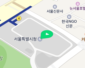
A Marker can be created just like a general Java object. Create an object, set coordinates in the position property, and set a map object in the map property to display a marker. Note that you should set the position property before setting the map property; otherwise an exception occurs.
The following code example creates a marker object and adds it to the map.
Marker marker = new Marker();
marker.setPosition(new LatLng(37.5670135, 126.9783740));
marker.setMap(naverMap);
Java
Marker marker = new Marker();
marker.setPosition(new LatLng(37.5670135, 126.9783740));
marker.setMap(naverMap);
Kotlin
val marker = Marker()
marker.position = LatLng(37.5670135, 126.9783740)
marker.map = naverMap
Set the map property to null, and the marker disappears from the map.
The following code example removes a marker from the map.
Coordinates
The position property specifies coordinates. Coordinates are required; if you add a marker with no coordinates to the map, an exception occurs. If you change the coordinates of the marker that has already been added to the map, the marker moves to the position of the changed coordinates.
The following code example specifies a marker’s coordinates.
marker.setPosition(new LatLng(37.5670135, 126.9783740));
Java
marker.setPosition(new LatLng(37.5670135, 126.9783740));
Kotlin
marker.position = LatLng(37.5670135, 126.9783740)
Icon
An icon is an important element that visually indicates a marker. Indicating a single location on the map like a pin, it cannot be omitted. You can specify the image and size of an icon.
Image
The icon property specifies an icon. Before specifying an icon, you should create an OverlayImage object. OverlayImage is a class that represents bitmap images that can be used by overlays. Using the factory methods defined in this class, you can create an instance from resources, assets, bitmaps and views. As images to be used as marker icons should be handled depending on user devices’ dots per inch (DPI), using Drawable resources is recommended.
The following code example sets an icon for a marker.
marker.setIcon(OverlayImage.fromResource(R.drawable.marker_icon));
Java
marker.setIcon(OverlayImage.fromResource(R.drawable.marker_icon));
Kotlin
marker.icon = OverlayImage.fromResource(R.drawable.marker_icon)
The NAVER Maps SDK provides various built-in marker icons. For the list of icons available, refer to MarkerIcons.
Add colors
The iconTintColor property adds a color to an icon image. The color you specified is additive-mixed with the color of an icon image. Note that the alpha of the additive color is ignored and only the alpha of the icon image color is used.
To make the mixed color vibrant, it is better to use a grayscale image icon. The NAVER Maps SDK provides built-in MarkerIcons.BLACK, which is appropriate for additive mixing.
The following code example specifies a marker icon with MarkerIcons.BLACK and adds red to the icon.
marker.setIcon(MarkerIcons.BLACK);
marker.setIconTintColor(Color.RED);
Java
marker.setIcon(MarkerIcons.BLACK);
marker.setIconTintColor(Color.RED);
Kotlin
marker.icon = MarkerIcons.BLACK
marker.iconTintColor = Color.RED
Size
Set the width and height properties to change the size of an icon.
The following code example sets a marker’s width and height to 50 px and 80 px, respectively.
marker.setWidth(50);
marker.setHeight(80);
Java
marker.setWidth(50);
marker.setHeight(80);
Kotlin
marker.width = 50
marker.height = 80
If you set width or height to SIZE_AUTO, the default value, the width or height of the icon is adjusted to the size of the image. It is similar to the Android WRAP_CONTENT.
The following code example specifies the icon size of a marker to SIZE_AUTO.
marker.setWidth(Marker.SIZE_AUTO);
marker.setHeight(Marker.SIZE_AUTO);
Java
marker.setWidth(Marker.SIZE_AUTO);
marker.setHeight(Marker.SIZE_AUTO);
Kotlin
marker.width = Marker.SIZE_AUTO
marker.height = Marker.SIZE_AUTO
Anchor
Using the anchor property, you can make the position indicated by an image match the position where a marker is placed. Anchor is the point on the icon image that will be placed at the coordinates of the marker. An anchor point is a proportion value where the top left is (0, 0), and the bottom right is (1, 1).
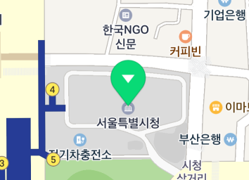
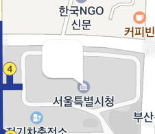
This property is useful when the default marker image is not used. For example, if you specify an image that has a tail at the bottom right as a marker’s icon as shown below, the image points to the bottom right but the marker is anchored to the map based on the point at the bottom of the middle of the image, which makes a gap between the coordinates of the image and those of the marker.
In this case, set the anchor property to (1, 1), which means the bottom right, to clear the coordinates difference between the image and the marker.
The following code example specifies the anchor of a marker to the bottom right.
marker.setAnchor(new PointF(1, 1));
Java
marker.setAnchor(new PointF(1, 1));
Kotlin
marker.anchor = PointF(1f, 1f)
Rotation
The angle property rotates an icon. It becomes bigger clockwise, based on the upper side of the screen. That is, the direction is up for 0 degree, right for 90 degrees, and down for 180 degrees.
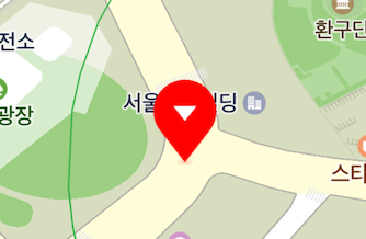
The following code example rotates a marker’s icon 90 degrees clockwise.
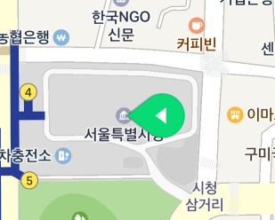
The figure below shows the result of rotating the marker icon 90 degrees.
An image is rotated around the anchor point. Therefore, you do not need to change the anchor even if the image is rotated.
The following code example rotates a marker’s icon 90 degrees clockwise around the bottom right point.
marker.setAnchor(new PointF(1, 1));
marker.setAngle(90);
Java
marker.setAnchor(new PointF(1, 1));
marker.setAngle(90);
Kotlin
marker.anchor = PointF(1f, 1f)
marker.angle = 90f
Flat
A marker basically maintains its shape even if users tilt or rotate the map.
However, if the isFlat property is set to true, the icon is flattened. Flat icons rotate and tilt as the camera rotates and tilts.
The following code example sets a marker icon to be flat.
Specify the angle property for a flat icon, then the icon is rotated against the map. The direction is north for 0 degree, east for 90 degrees, and south for 180 degrees.
The following code example sets a marker’s icon to be flat and rotates it 90 degrees clockwise.
marker.setAngle(90);
marker.setFlat(true);
Java
marker.setAngle(90);
marker.setFlat(true);
Kotlin
marker.angle = 90f
marker.isFlat = true
Perspective
Since markers are not displayed in perspective by default, there is no difference in size between the distant marker and the closer marker even if the map is tilted.
Set the isIconPerspectiveEnabled property to true to apply perspective to icons. Icons displayed in perspective get bigger as they appear closer to the bottom of the screen, and smaller as farther.
The following code example applies perspective to a marker’s icon.
marker.setIconPerspectiveEnabled(true);
Java
marker.setIconPerspectiveEnabled(true);
Kotlin
marker.isIconPerspectiveEnabled = true
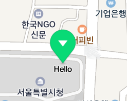
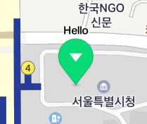
Caption
A caption is text displayed with a marker image. It is used to show text information of the position which a marker points to.
Text
The captionText property specifies text to be displayed as a caption. If the property is set to an empty string or null, a caption does not appear.
The following code example specifies the caption text of a marker a "Hello".
marker.setCaptionText("Hello");
Java
marker.setCaptionText("Hello");
Kotlin
marker.captionText = "Hello"
Line break of caption text
The captionRequestedWidth property limits the width of caption text. If a line of caption text is too long to fit the specified width, it automatically wraps. Note that if text is written without spaces, it may not wrap. If the property is set to 0, caption text does not wrap.
The following code example limits a marker’s caption width to 200 px.
marker.setCaptionText(“Very very very very very very very very very long caption");
marker.setCaptionRequestedWidth(200);
Java
marker.setCaptionText(“Very very very very very very very very very long caption");
marker.setCaptionRequestedWidth(200);
Kotlin
marker.captionText = "Very very very very very very very very very long caption"
marker.captionRequestedWidth = 200
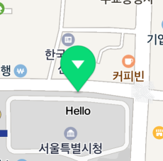
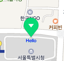
Direction
A cation is placed beneath an icon by default, but you can change the alignment with the captionAlign property. There are 9 available options including top, bottom, left, right, diagonal directions and center, which are defined in the Align enum.
The following code example places a marker’s caption above an icon.
marker.setCaptionAlign(Align.Top);
Java
marker.setCaptionAlign(Align.Top);
Kotlin
marker.captionAlign = Align.Top
The captionOffset property specifies the distance between the icon and the caption. Note that the captionOffset will be ignored if the captionAlign property is CENTER.
The following code example specifies the distance between a marker’s icon and caption to 30 px.
marker.setCaptionOffset(30);
Java
marker.setCaptionOffset(30);
Kotlin
marker.captionOffset = 30
Color
The captionColor property specifies a caption’s color, the captionHaloColor property specifies a caption’s outline color.
The following code example sets a marker’s caption color to blue, outline to light green.
marker.setCaptionColor(Color.BLUE);
marker.setCaptionHaloColor(Color.rgb(200, 255, 200));
Java
marker.setCaptionColor(Color.BLUE);
marker.setCaptionHaloColor(Color.rgb(200, 255, 200));
Kotlin
marker.captionColor = Color.BLUE
marker.captionHaloColor = Color.rgb(200, 255, 200)
Size
The captionTextSize property specifies the size of caption text.
The following code example sets the size of a marker’s caption text to 16 dp.
marker.setCaptionTextSize(16);
Java
marker.setCaptionTextSize(16);
Kotlin
marker.captionTextSize = 16f

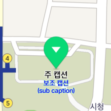
Sub caption
A sub caption is another caption that can be added to a main cation. Allowing you to specify its text, color and size, separate from the main caption’s, sub captions are useful to provide addition information. Note that the alignment and offset of a sub caption cannot be specified; it is unconditionally placed beneath the main caption.
The names of the properties of a sub caption are mostly the same as those of the main caption, except that they begin with sub, such as subCaptionText, subCaptionColor, subCaptionHaloColor, subCaptionTextSize, and subCaptionRequestedWidth.
The following code example adds a sub caption to a marker.
marker.setSubCaptionText("Sub caption\n(sub caption)");
marker.setSubCaptionColor(Color.BLUE);
marker.setSubCaptionHaloColor(Color.rgb(200, 255, 200));
marker.setSubCaptionTextSize(10);
Java
marker.setSubCaptionText("Sub caption\n(sub caption)");
marker.setSubCaptionColor(Color.BLUE);
marker.setSubCaptionHaloColor(Color.rgb(200, 255, 200));
marker.setSubCaptionTextSize(10);
Kotlin
marker.subCaptionText = "Sub caption\n(sub caption)"
marker.subCaptionColor = Color.BLUE
marker.subCaptionHaloColor = Color.rgb(200, 255, 200)
marker.subCaptionTextSize = 10f
Opacity
The alpha property specifies opacity of a marker. Opacity applies to both an icon and a caption. The value ranges from 0 to 1, where 0 is fully transparent and 1 is fully opaque. Even though the alpha property is 0, the subjects are still considered to be on the screen, unlike the case where the visible is false. Therefore, they can be overlapped or can receive events.
The following code example sets a marker to be semitransparent.
Overlap
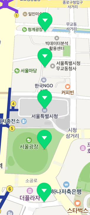
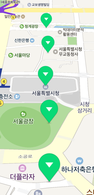
As a marker is an overlay indicating a location on the map, multiple markers can be overlapped when the map is zoomed out. Overlapping markers can make you hardly see the locations they’re pointing to. In this case, you can set a specific marker to have priority over others, or hide captions or symbols of overlapped markers, for enhanced focus on information and reduced complexity.
Z index
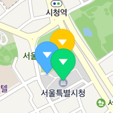
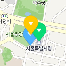
When multiple markers are overlapped, markers closer to the bottom of the screen are basically displayed on top of those more distant than them. That is, markers displayed on top of others change as the camera is rotated, as shown in the figure below.
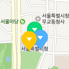
The globalZIndex and zIndex properties specify a z index which defines the stack order of a marker. A marker with a high z index is displayed on top of those with lower z indexes.
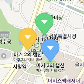
The following code example specifies the stacking order of three markers as yellow -> green -> blue.
yellowMarker.setZIndex(100);
greenMarker.setZIndex(0);
blueMarker.setZIndex(-10);
Java
yellowMarker.setZIndex(100);
greenMarker.setZIndex(0);
blueMarker.setZIndex(-10);
Kotlin
yellowMarker.zIndex = 100
greenMarker.zIndex = 0
blueMarker.zIndex = -10
Although the yellow marker is farther from the bottom of the screen, it is displayed on top of others because its z index is higher than others’.
Overlapping of markers and symbols
Overlapping of markers and symbols makes the map more complex and less visible.

Set the isHideCollidedSymbols property to true to hide symbols overlapped with markers.
The following code example sets symbols overlapped with markers to be hidden from the map.
marker.setHideCollidedSymbols(true);
Java
marker.setHideCollidedSymbols(true);
Kotlin
marker.isHideCollidedSymbols = true

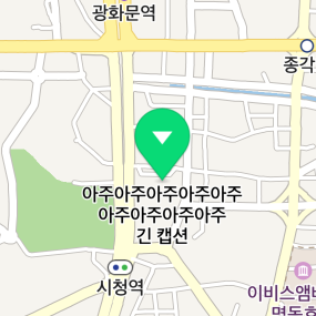
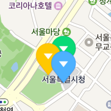
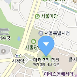
Overlapping of markers
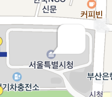
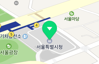
As you can see in the figure below, a marker can be overlapped with other markers as well as symbols, making the map hard to read.
Set the isHideCollidedMarkers property to true to hide overlapped markers. Then, only markers that are not overlapped are displayed on the map. If two markers are overlapped, the one with a higher z index has priority over the other.
The following code example sets markers overlapped with other markers to be hidden from the map.
marker.setHideCollidedMarkers(true);
Java
marker.setHideCollidedMarkers(true);
Kotlin
marker.isHideCollidedMarkers = true
You can also set the isHideCollidedCaptions property to true to hide the caption of a marker overlapped with other markers. Then, only captions of markers that are not overlapped are displayed on the map. Note that if the hideCollidedMarkers property is set to true, hideCollidedCaptions is ignored.
The following code example sets the caption of a marker overlapped with other markers to be hidden from the map.
marker.setHideCollidedCaptions(true);
Java
marker.setHideCollidedCaptions(true);
Kotlin
marker.isHideCollidedCaptions = true
Force markers to appear
Set the isForceShowIcon property to true to force a marker icon to appear even if it is overlapped with other markers for which isHideCollidedMarkers is set to true. The isForceShowIcon property forces important markers to appear while hiding overlapping markers. Set the zIndex of an important marker to be higher and set its isHideCollidedMarkers and isForceShowIcon to true, while lower the zIndex of a less important marker and set its isHideCollidedMarkers to true.
The following code example hides overlapped markers but forces an important marker to appear.
List<Marker> importantMarkers = ... // Important markers
List<Marker> normalMarkers = ...    // Less important markers

for (Marker marker : importantMarkers) {
    marker.setZIndex(1);
    marker.setHideCollidedMarkers(true);
    marker.setForceShowIcon(true);
}

for (Marker marker : normalMarkers) {
    marker.setZIndex(0);
    marker.setHideCollidedMarkers(true);
    marker.setForceShowIcon(false);
}
Java
List<Marker> importantMarkers = ... // Important markers
List<Marker> normalMarkers = ...    // Less important markers

for (Marker marker : importantMarkers) {
    marker.setZIndex(1);
    marker.setHideCollidedMarkers(true);
    marker.setForceShowIcon(true);
}

for (Marker marker : normalMarkers) {
    marker.setZIndex(0);
    marker.setHideCollidedMarkers(true);
    marker.setForceShowIcon(false);
}
Kotlin
val importantMarkers: List<Marker> = ... // Important markers
val normalMarkers: List<Marker> = ...    // Less important markers

importantMarkers.forEach { marker ->
    marker.zIndex = 1
    marker.isHideCollidedMarkers = true
    marker.isForceShowIcon = true
}

normalMarkers.forEach { marker ->
    marker.zIndex = 0
    marker.isHideCollidedMarkers = true
    marker.isForceShowIcon = false
}